Branding / Commercials
The concept of telemedicine was well known in Sweden, but was heavily associated with the industry leader – to the point where over 30% of the viewers of Doktor.se ads thought they had seen the competitor. We needed to immediately stop the bleeding and move the Doktor.se name closer to the top of mind spot for the category. The Doktor.se name complicated things as it is a generic name with little identity.
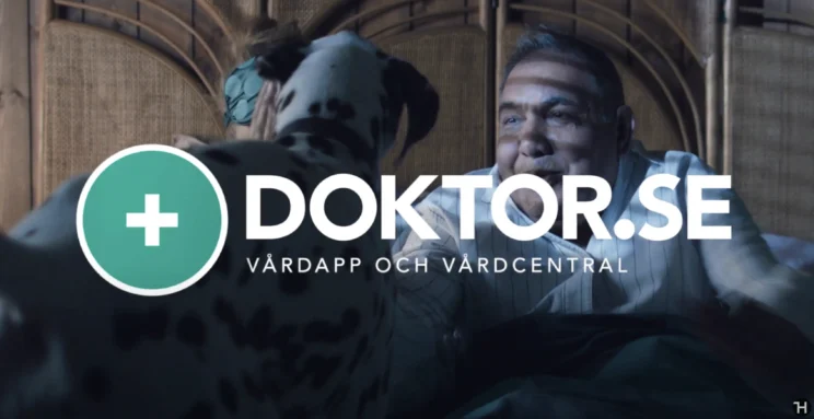
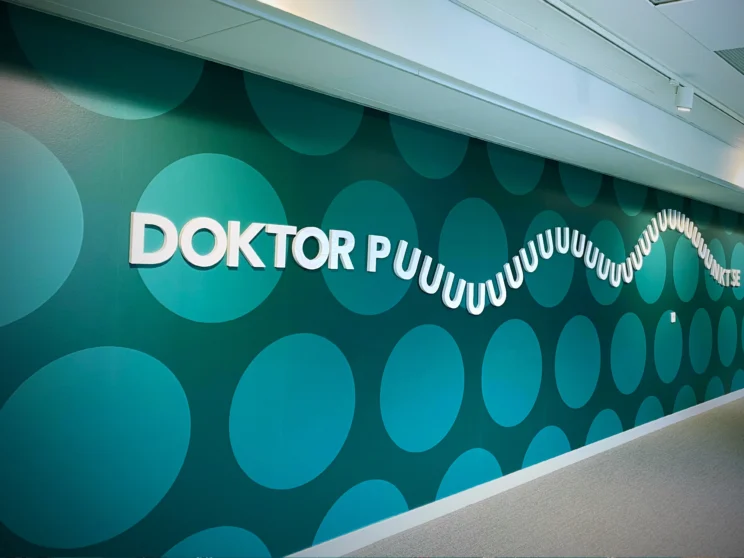
The unconventional solution was to focus on only on the name and de-prioritize everything else. Since the name was highly generic, we went after the only thing in the name that we could use to differentiate ourselves from all the competitors: the fact that we had a dot in the name. This seemingly insignificant detail was lifted up and made into a puzzle for the audience to solve. The theory was that if you remember the dot, you remember the name. We incorporated the dot everywhere, created a dot pattern to use everywhere and created films where we built up a cluedo-like puzzle where the answer was “dot”. This forced the viewer to come up with the solution and remember the dot, and thus the name. We then used all other tools at our disposal, from casting, to music, to set design, to lighting, to make the brand likeable.
The strategy turned out to be a home run. Spill was reduced to single digits, the brand became one of the most recognizable in its industry and the re-branding was nominated as the most effective campaign of that year.
During the pandemic, this is how we wanted everyone to greet each other
